Two selected photo shots were used to create a combined image that I used as a background for my internet page. The resulting “photo” was supposed to satisfy two criteria. The first one was to please my own personal perception and that of the potential visiting internet surfers. The second one, with regard to the text written on its foreground, was to create a certain degree of transparency aiming to facilitate its reading. I expected to obtain a background mild in colours and contours.
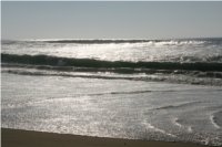
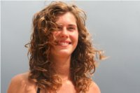
In the right column of this page you may see three photo shots. “Biscarrosse Plage” is the initial background for the second one, that is “Hélène”. The intention was to immerse the image of Hélène, my own daughter, into the Atlantic Ocean background. The sizes of these two photos, measured in pixels, are identical. It’s not necessary, but keeping in mind the proportions that I wished to preserve, when combining two photographs, was important. In any case I could expand or shrink a photo with photo tools to suit my own feel.
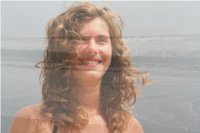
The third “photo” is the resulting combination of the first two - a technically reworked fusion.
I desaturated the “Biscarrosse Plage” photo, using the hue-saturation tool, to make it slightly brighter and a bit more grey. Then I used a linear graduation, through the gradient tool, starting from the top of the photo down to its bottom, to make it more adapted for the reception of the “Hélène” photo. The process consisted of dragging the cursor in the direction I wanted the gradient to go. The choice of the initial foreground colour for graduation was not to neglect. I picked the colour from “Hélène” photo. As a result, the transition between the “Biscarrosse Plage” background and the inserted “Hélène” photo got smoother.
Now, from the “Hélène” photo I selected a circle or rather a vertical ellipse containing the head and the arms of the girl, and pasted it onto the “Biscarrosse Plage”. When selecting and cutting the circle I chose the feather edges option to create a certain degree of transparency close to the border of the ellipse. It’s called the graduated selection. Consequently, the selected and cut part of the “Hélène” image integrated smoothly into the “Biscarrosse Plage” background.
When the circle with “Hélène” was inserted into the “Biscarrosse Plage” initial background, I defined for it a 50 % transparency. Thus, the background of the ocean went up right through the smiling and dreaming face of the girl.
I desaturated slightly that final composition and made it more bleak. It was based on my subjective estimation with regard to the readability of the text written in the foreground. The final thing was to safeguard the page with some significant reduction of its weight as measured in bytes. It’s very useful for faster loading of any internet page. Less time is needed when elements of the page are lighter in size - bytes. I found that the visual quality of the background doesn’t change when reducing its size.
All steps presented through this page were done using GIMP - GNU Image Manipulation Program that is distributed freely through Internet.


